Wednesday, July 31, 2013

Day 283


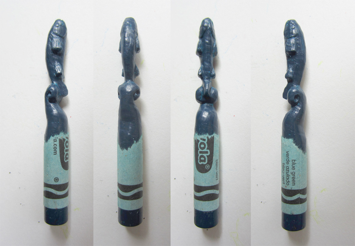
I have small complaints about each individual crayon carving but when put together as a whole, they look pretty awesome (in my humble opinion). Above you can see an alternative design I had for the Tyrell flower.


With the crayons done, I needed to display them for the art show. I was going to make something using the box the crayons came in but decided to go a fancier route. I bought a small shadow box that was just big enough to fit all the crayons. The next larger size would have been too big. Then I needed to make something to actually hold the crayons upright. My original idea did not work at all but after multiple attempts, I ended up with what you see below.


The use of string was part of the original idea. The substructure wasn't going to look nice so all the string was supposed to cover that up. I also wanted the string box to be removable so you could take out the crayons to look at them better. Unfortunately, the box is wedged in there pretty tightly. You can still pull the crayons out individually but it's not as easy as taking out the whole thing. 


So a lot of time was put into this and I'm really happy with how things turned out. Unfortunately, I didn't take any pictures of the actual art show but they're floating around on the Interwebs somewhere. The day before turning in my piece for the show, I decided to make something for Shiu Pei as a congrats for putting on her first art show. I had this brown crayon left and decided to make her an owl. Then I got ambitious and decided to make it multicolored. So using my tools, I melted yellow crayon wax onto the brown. I had to be careful because the hot yellow wax would melt the brown wax and mix together. I wanted a nice pure yellow but it was hard to do. Instead of having brown splotches in the yellow, I tried melting and mixing the entire yellow area to make a more consistent yellow brown color. If I had more time, I could have made it little better but it's not bad for my first attempt at multicolored crayons. Anyway, thanks for putting on a great show Shiu Pei. It was a hoot.

Day 282


So the art show has come and gone. It was a lot of fun especially since so many people came out for it. Now I can post pictures of the other crayon carvings I haven't shown yet. Above is the Baratheon stag with a crown. The anters were the tricky part here. I carved inward straight across to make the three prongs and then carved up and down in the middle. It wasn't as bad as I thought it would be but it was hard accessing the middle parts to shape and smooth areas there. This is one of my favorite crayons since it's easy to see what it is even from a distance.


Next we have House Arryn and their sigil is a falcon and moon. This may have been the hardest one to do. Carving a bird in flight would have been tough enough but making a bird while maintaining space for a crescent moon just made it even harder. Despite that, it turned out really well and is also one of my favorite carvings. The only downside is that the blue crayon is so dark and it's hard to see the details.


Here we have an orange crayon for House Martell. Watchers of just the Game of Thrones show have not met this family yet. Their sigil is a sun pierced by a spear. The sun had to be small since there's no way to make a sphere bigger within the space of a crayon. I couldn't think of or didn't want to attempt an alternative so I just carved the sun design into the sphere. I didn't want to have a narrow spear shaft so I wrapped a snake around it since snakes are also associated with this family. This is probably the hardest crayon for someone to figure out which house it goes with since the sun doesn't immediately look like a sun and you can only see the spear point.


Here is the crayon for the Targaryens. Their sigil isn't just a dragon but a three headed one. I was worried about having enough space for three and thought about having them at different levels but I realized that the heads would be small and could fit side by side. For the wings, I thought of having them stretched up or folded back but those wouldn't have worked out well. Then I got the idea of having the wings wrap around the body which was much easier to do and would also look better. I added in a tail visible from the front and then carved flames around the base. I like how this turned out but it's hard to get the whole picture without turning it around in your hands.


Here is a flower for House Tyrell. I was worried about the narrowness of the stem and tried different things but ended up sticking with a stem. I made it narrow looking from the front but thick when viewed from the side so it wouldn't break. I'm disappointed that I couldn't put in thorns since that's another symbolic thing about the family. They're sweet and pretty like a flower but you have to beware their thorns. I was also sad that in the display case, you couldn't see the top of the flower. I thought the petals there turned out really well.


Here are more clear pictures of the crayons you've already seen. I'm not happy with the Greyjoy kraken. I'm not sure why. I think I just wish I could have done something more epic with the tentacles. Black also makes it hard to see.


The Lannister lion turned out well. My only complaint is that the sigil has a more medieval stylized lion design and this is more of a realistic take. I also didn't make the lion stand on a stack of coins like I originally planned.


The Stark direwolf is probably the one I'm most disappointed by. Because it's the most popular house, I don't think the carving lives up to that. Design-wise there wasn't really much flexibility there and execution-wise it could have been better.


The Tully fish was another really dark crayon which I didn't like but otherwise it's not too bad. If you look closely, you can see that the fish and the wave aren't aligned correctly. They're slightly off by a few degrees. Group shots in the next post.

Tuesday, July 16, 2013

Day 279


So far I've done seven of the nine crayons but I'm not going to post them all now. You'll just have to go to the art show to see them. Or wait until I post them after the show is over. I can say that the most recent ones I've made are pretty good. The first three I showed here were the easier ones. I left the harder ones for last so naturally they look more impressive when complete. I will show one more here though since this was the only time I took pictures while I was working. This is the Lannister lion if you couldn't tell. I was aiming for the standing medieval lion you typically see on shields and coats of arms. Unfortunately that silhouette doesn't match up with a crayon very well. A big problem are the arms where they should be outstretched, one up and one down. To fit on a crayon, they pretty much have to go straight up and down instead of at an angle which looks a little weird. It kinda looks like one of those Asian lucky cats but I can't really do anything about it now. Despite that, it turned out much better than I was expecting.


The upper photo are pictures while I was working and the tentative finished result is below. My basic methodology was to scratch out a sketch of what the lion's profile looks like on either side. Then I started carving straight inwards leaving wax to be the eventual arms and legs. Once I left enough bulk for those, I started carving the front and back to get the right profile shape. Once it looked like I had the right amount of wax left for the head, I went back to the arms and legs to make sure they were proportional. When I had the general shape I was going for, I started refining the different parts. I carved in a face and was shocked that it looked like a lion because I just had a blob for the head at that point and wasn't sure where I was going there. I saved a bulk of wax on the back for the tail which I did last. The initial plan was to have the lion stand on a stack of coins but I was tired at this point so I stopped. I might go back and do it but the feet aren't level so I'm not sure how it'll look.

Day 278


During the week, I've also been busy carving crayons. Above is a picture of my work station, a big piece of butcher paper on the ground. Unfortunately, my desk is too cluttered to work on. I mainly use three instruments. One is a paintbrush to brush wax shavings off of the crayon and my fingers. The other two are dental instruments for carving the wax.


I mainly use the one with the blade like tip. Each end is offset by 90 degrees. I use it to shave off large areas of wax with the heel of the blade. Or I can use it softly to round off edges or smooth areas. I can also do more fine work by using just the tip. The other instrument I use for gouging out troughs and indentations that will have a rounded bottom. Also sometimes it can reach areas better than the first instrument. For anyone curious, in dentistry these instruments are used for filling cavities. For example after drilling out the cavity, you would put in an excess amount of silver filling material and then use instruments like these to carve the filling and restore the natural tooth shape. So while carving a crayon is tough, it's easier than carving a filling in someone else's mouth.

While I've been working, I've actually broken two crayons so far. They were in areas where the carving was narrow. I also think holding the crayons in my hands for so long warms up the wax and makes it more liable to break. Despite that, I was able to fix them. I said I carved wax teeth in dental school so I have some extra tools at my disposal. For the crayons, I'm carving away wax from a big bulk. For the teeth, I built up the wax instead and then carved it down. I have an electronic device with a heated tip that can melt wax away or pick up drops of wax to apply onto whatever I'm working on. So I can theoretically fix any mistakes I make as long as I have an outside source of wax. For most of the crayons, I cut off the tips and saved them just in case. The downside is that the wax I apply is not as strong as the original wax and could break off. I have to melt a large area of the carving to make sure the new wax mixes well with the old. To fix the breakages, I melted a hole into the center of the crayon at the break and then placed a small section of a paperclip into that. Once cooled, I melted another hole into the other piece of crayon and placed that onto the clip. Once I had the two pieces aligned correctly, I melted all the wax around the fracture and applied more wax. Like a candle, some of the wax burns away so more wax is always necessary. It seemed to do the job. You can't see the break and the paperclip should ensure it doesn't break there in the future.

Day 277


Here is the final product. I like it. I always have low expectations of myself regarding painting so I end up impressed with what I make. This was a fun project to do. The model itself was fairly simple. Minimal sculpting was needed, just manipulation of basic shapes. Then having a variety of materials to paint was interesting.


Random things: I really didn't do anything with the canister on the back since it's so dark I didn't think you would see anything. I guess I could have put in scratches. The stripes on the legs took a long time to do since it's hard to paint smooth clean lines onto a three dimensional object. I tried to put dirt where I thought they would logically appear like on the bumps of the rubber band over the paperclip. However for the body, I wasn't sure if the dirt came after the doll was made or if there was already dirt on it. I kind of went halfway; it's slightly cleaner near the rubber bands. There's a rabbit painted on the top of the bottle cap.   


I think I painted the majority of this using my mouse instead of my pen and tablet. I just find using the mouse easier. I'm not sure if I should be forcing myself to use the tablet in order to get better with it though.


Below is the painted map with all the layers. You can see that the baseball stitching isn't symmetrical but it's not that noticeable on the model.

Day 276


Now I can finally paint the model. Above you can see the base layer of paint so everything else is going on top of this. Before when I was painting the Pokemon, I was very careful to keep areas I painted (within a single layer) away from each other so there wouldn't be any accidents happening on borders between colors. That was because it was one big geometric object, however this model is made up of many separate objects. So I can paint the rubber bands pink without worrying about it ending up on the body on accident as long as I don't let the cursor stray too far.


Above and below are images after I painted the second layer. With the legs, I just added in some more basic coloring but for other areas, I added in more details. For the arms, I painted in the strands of fiber and I used a burlap stencil on the hand. For the marble on the other hand, I just painted freehand. It wasn't looking too good but then I blurred the colors together and it looked better. For the baseball stitching, I created an image of a single stitch in Photoshop and used that as a stamp in Mudbox. So I traced the line on the ball and a stitch would appear every few pixels.


Next were layers for dirt and the aged look. There's not much to say except that it took awhile. I also edited the model for the baseball a bit. I just bulged the stitching seam to give it a more realistic look.


I didn't paint in dots for the thimble because I wanted to take care of that with a bump map. I tried using a picture of a thimble as a stencil but that didn't work out. I ended up isolating just one dimple from a picture in Photoshop and, like the stitching for the ball, applied it one by one on the thimble. It turned out better than I expected. I thought maybe it would only look good from one angle but it actually looks three dimensional from any angle. For the rest of the bump map, I just duplicated the dirt layers to give the whole model a rougher appearance so it wouldn't look too smooth or flat. I tried to make it more subtle except for certain areas like the stitching and the hand. You can see the bump layer below with color turned off. I also made a layer for shine but since this is an old object, there wasn't much to make shiny. I just applied a little brightness to the thimble, cork screw, bottle cap and shoes.

Day 275


After completing the model for my Bioshock guy, I had to create the 2D map for him. As usual, it's a lot of cutting and flattening in a different program. Above, all the bright green lines are where I made cuts. This whole process took forever. I sat down expecting to get some painting done and I ended up spending the whole night just doing this. The program I use is awesome but it just runs kind of slowly and is not super responsive. It was probably because there were too many polygons. I wasn't concerned with keeping the numbers low so there was a lot of excess.


Anyway, I ended up with the map above. The large circles are the baseball. The large rectangle is the tank on the back. The next two large pieces are the body. The C shaped pieces are all the tacks. The long strips are the rubber bands, paperclips, and string. The coiled twine arms were hard to flatten. I didn't do the best job there so some artifacts are probably going to show up there when I do the painting. If you don't know what the monster looks like that the doll is supposed to emulate, I added it in below.

Friday, July 5, 2013

Day 272


I've done three crayons so far. I would say I'm maybe 70-80% done with each. I did this because I figure by the time I get to the ninth one, I will hopefully be better at carving crayons. Then I can go back with my new skills and take each crayon to 100% completion. Anyway first up is the Stark wolf. It looks more like a dog than a wolf to me though. I accidentally made the head too wide so thus the eyes look too wide apart from the front. This happened because I was carving by looking at the side so it looks normal from the side and messed up from the front. I'll have to go back and fix that. The Stark wolf sigil has sort of tufted fur on the neck so that turned out ok on the crayon.


Next is the Greyjoy squid. It looks pretty much the same from the sides and front and back so you don't need a lot of viewpoints. Black was a little harder to work with since it was harder to see what I was doing. My main complaint is that I didn't make the tentacles wavy enough. From the front I got some waves in when I realized that but it was too late for the side. I also couldn't put in the two extra long tentacles that squid have without peeling off the entire crayon wrapper.


The Tully fish was a lot harder than I thought it would be. First off, the crayon was really dark (it's lightened above) which is disappointing because it's harder for you to see what I carved. Unfortunately, I don't have any lighter blue crayons. Also this crayon was much softer and gummier than the first two so I had to stop frequently to brush off the shavings which would stick back onto the crayon instead of falling off. The fish was tricky to carve because it has so many fins. And this was even after having to eliminate the dorsal fin because there just wasn't enough room for it. I had to push a lot harder to carve this crayon which made me very afraid I was going to break it around the narrow tail area.


Here's one carved tooth from dental school if you were wondering what they looked like. They were for making gold crowns. The wax goes into cement, melt the wax, inject molten gold, cool and break out the gold crown and polish. Same method for making cast jewelry. 

Day 271

Shiu Pei is putting on an art show in about a month with a Game of Thrones theme. I was invited to make something for it so I thought I would give it a try. I guess most people paint or draw something but I'm not a very good painter or drawer. Maybe I'm above average but compared to real artists, I didn't want to try to compete. The other option was to make some sort of sculpture. I thought about that for a bit and then an idea popped in my head. About two or three years ago, I saw a picture of someone who sculpted crayons into a bunch of animals. I thought that was cool and wanted to give it a try. I bought crayons but never got around to doing it. So my idea now was to carve an appropriately colored crayon to represent each of the great houses of Westeros. But first I needed to do a test.


I picked out a crayon color I didn't think I would use: pink. Since it was pink, I thought I would try carving a unicorn. Unfortunately, the tip of the crayon wasn't in the right place to make a horn so it ended up being a horse instead. Carving wasn't too bad. I've had to carve wax before in dental school when I had to make teeth out of wax. However, the wax I used in school was a lot harder (as in physically harder) than the crayon so it was easier to work with. Since the crayon is softer, when I try scraping across the surface, my instrument will stutter across. So to make a smooth stroke, I have to push harder and then since I'm pushing harder, I lose my soft touch and ability to do detailed work. But I think I can work with it so I proceeded forward.


The real hard part about carving a crayon is that I have a very limited volume of wax to work with. And once I take wax off, I can't put it back on (actually I might be able to but I don't want to cheat...yet). So I have to plan things out so I made some quick sketches which I usually don't do. There are nine houses and I drew a front and side view for each. First is the Stark's direwolf sigil which will be a white crayon (I would have preferred gray but I don't have that color) The sigil is typically just the wolf's head so that's what I'll be doing. The head's gonna be pretty squashed though. Next is the Lannister lion in yellow crayon. I'm doing the whole body and will try to have it stand on a stack of coins. Next is Tyrell flowers in green. I wanted the base to be coiled vines with thorns but that wouldn't make sense with just a single flower on top so I'm doing three flowers now. Why not?


Next is a Tully fish in a shade of blue. It'll get pretty narrow at the tail so I'm doing a water splash around it to beef that area up so it'll be less likely to break. Next is the Greyjoy squid in black. It's pretty crayon shaped to begin with so hopefully it won't be so bad. Then it's a hawk and moon for House Arryn in blue. I would have preferred white but that had to go to Stark. It's gonna be a hawk in flight up against a crescent moon. I'm not sure if I have enough room for that though.


Next is Martell sun and spear in orange which has two issues right off the bat. The sun is going to be as wide as the crayon is wide so it's going to look tiny. Then the spear is narrow which means the crayon might break. I'm going to try to get around that by wrapping a snake around the spear but the sun is still going to be a problem. Next is the Baratheon stag in peach. Their colors are black and yellow which were already taken so I settled with peach. It's going to be a stag head with a crown on the bottom. The antlers are going to be a challenge. Last is the dragon in red for Targaryen which has three heads, wings, legs and a tail. Sounds pretty tough. I didn't even try to make a decent sketch for it. I'll worry about it later.

Day 270


Here is the final model after making some edits in Mudbox. The doll's right arm had to be moved outward to go over the rubber band. It sticks out a little too much for my tastes. Ideally I would move the rubber bands down a bit but that would have been too much work.


I think the model looks pretty good. There were a lot of parts but just going through them one by one made it manageable. Painting this should be pretty interesting since it's made of so many different types of materials. This was another reason why I picked this doll to model.


Day 269


Next I need to attach the tank to the body with a lot of rubber bands. This part was fairly tedious since each one had to be uniquely adapted to the body and tank and to the other rubber bands. After the rubber bands, I had to make a paper clip for the front (and then tweak all the rubber bands to fit around the clip).


Then it was onto the hands. The "hand" on the left is made of a big bead and then a thimble on top of that. Sticking out the end should be the cork screw from a wine opener. Again I used another helix and you can see how changing the variables can create a very different look compared to the helices in the arms. The cork screw still needs to be edited a little more which I will do in Mudbox. The other hand is some sort of sack thing. I couldn't tell from any picture what it should be. Lastly, I had to make some string that wraps around the neck and the top of the tank. The arm in the pic below goes through the rubber band which will also be fixed in Mudbox.

Day 268


Let me first say that I did not make the above image if for some reason you were thinking that. This is the inspiration for my next project. It's from the Bioshock videogame series. Above is a doll version of the first game's big boss character made of random found objects. It's pretty old but it got stuck in my head because they actually produced a real life version of the doll and I wanted to buy one. Anyway, I thought it would be an interesting thing to make.


I started out with a sphere for the baseball head. The stitching will be painted on later. Then I made a tack, duplicated it a few times and placed them over the face. Next I made the cage over the face which are supposed to be twisted paperclips.


The body is made from the body of a plastic doll. Then it has rag doll type legs. The arms are made of twine/yarn. You've seen me use a variety of starting shapes like spheres, cubes and cylinders. Another starting shape is a helix. I tweaked different variables for the helix to get the right look and then I duplicated and rotated it to get the right double helix rope look. Then it was a quick trip to Mudbox to give it the right bend. Next is the tank on the back. It's hard to tell from pictures but I think it's suppose to be the plastic canister that photographic film used to come in. On top of that is a bottle cap held on with a nail.